Last Updated on 2 years ago by Gülenber Han
Choosing a font for your organization is one of the most important components of the corporate identity design process. They build a visual hierarchy, generate harmony, and establish your brand’s overall tone. In this process, you can benefit from brand consultancy service.
According to MDG Advertising, 75% of consumers rate a company based on its website design, while 72% think package design impacts their purchasing decisions. Because typefaces play such an important part in website and package design, finding the right font for your business may be quite advantageous. We’ll show you how to choose a font for your brand in this helpful guide.
What Are Serif Fonts?
Serif fonts are the most conventional font styles, and they represent class and legacy, making them excellent for companies trying to develop a strong corporate identity.
Due to their traditional character, serif fonts also express trust and respectability, making them ideal for companies that center around grandeur and authority.
Serif fonts are perfect if you want to establish a formal brand personality. They assist you in demonstrating your dependability while also increasing brand recognition. Serif typefaces are used by brands such as Rolex, Tiffany & Co., Prada, Gucci, Vogue, and many more.
Serif fonts come in a variety of styles, including:
- Old-style: Serifs in the old-style feature wedged ascenders and a great contrast between thick and thin strokes in the letterforms. Of all the serifs categories, this is the most conventional and classic one. Garamond is an antique typeface with slanted counters and scooped serifs that are commonly used in body text and book production. It is named after the sixteenth-century Parisian engraver Claude Garamond.
- Transitional: Serifs have a higher contrast between stroke thickness and larger, bracketed serifs, which originated from old-style serif typefaces. Times New Roman is a transitional typeface that is commonly used for plain text reading due to its efficient letterforms. Libre Baskerville is a conventional serif letterform with larger counters and less contrast than the traditional Baskerville typeface, created primarily for digital body text.
- Slab Serif: Slab serif fonts, such as Clarendon, have thick, blocky serifs that are sometimes as thick as the letter strokes themselves. Courier, Excelsior, and Rockwell are examples of slab serif typefaces.
- Didone: The Didone family of fonts, often known as Modern serifs, is distinguished by a dramatic contrast in stroke thickness. These typefaces aren’t suited for long-term reading or body text, but they might inspire a sense of luxury or elegance. Didone typefaces include Didot and Bodoni, among others.
What Are Sans-Serif Fonts?

Sans serif typefaces, unlike serif fonts, have smooth lines, giving them a clean, sleek, and modern appearance. Chooseing font like a sans serif font for your company name or logo is a terrific way to convey simplicity and a clear approach. Because of the clean and simple style of this typeface, firms may use it to emphasize clarity in their logo.
You can choose sans serif if you want to portray simplicity and modernism in your brand name. Sans serif typefaces are used in the branding of well-known companies such as Microsoft, Panasonic, Kawasaki, Jeep, LinkedIn, Calvin Klein, and Google.
Sans-serif fonts come in a variety of styles.
- Grotesque: Sans-serif fonts have generally consistent capital letters and don’t have a lot of variation in stroke widths. Franklin Gothic is a grotesque sans-serif typeface with a very bold style.
- Neo-grotesque: Sans-serif typefaces are characterized by their neutrality and ease of readability. These fonts contain fewer strokes than typical grotesque fonts and finer letterforms than regular serif types. Arial is a neo-grotesque font with fewer strokes than traditional serif fonts. Arial sans-serif fonts have broader, smoother curves with diagonally cut terminal strokes. Helvetica is a bold letterform with a high x-height closeslose kerning.
- Geometric: Letterforms in geometric fonts are influenced by geometric shapes and have a more contemporary appearance. Futura is an example of a geometric sans-serif typeface with more weighted letterforms. Another example of a geometric font family is Avant-Garde Gothic.
- Humanist: Sans-serif fonts are influenced by classical letterforms with thin and thick strokes that alternate. The flexible letter spacing, broad counters, and huge x-height of this typeface make it easy on the eyes for tiny writing. Verdana is a humanist sans-serif designed by type to make computer reading simpler.
What Are Script Fonts?

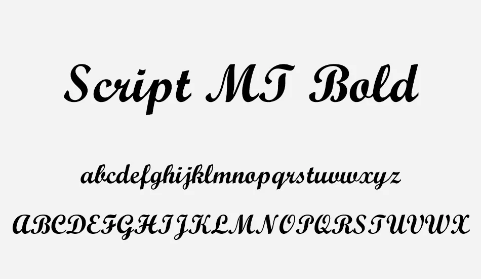
Script fonts are more elegant than serif fonts since they are handwritten. They get rid of the blocky print style and replace it with a natural-looking cursive typeface. Script typefaces evoke feelings of creativity, elegance, independence, and femininity due to their handwritten, stroke-like look.
You can prefer this when choosing a font to make your target audience feel more intimate with your brand. Script typefaces, on the other hand, are less professional, so use them only when you want to show off your brand’s creative side. While they are elegant and artistic, they are difficult to read in some situations.
As a result, you must ensure that the script typefaces you select stress readability as well. Script typefaces are used by companies such as Coca-Cola, Instagram, Cadbury, and Cadillac.
How to Choose a Font for Your Brand?
When it comes to choosing a font for your business or design project, there are several aspects to consider.
- Recognize your brand’s identity: Before you pick a typeface that will express your company’s tone nonverbally, consider your brand personality. Start by finding a few terms that characterize your brand’s identity. If your company is ‘authoritative’ or ‘educational,’ a transitional serif typeface may be appropriate. A script typeface could be right for you if you’re ‘quirky’. Consider choosing font like a sans-serif typeface if you want to seem ‘creative’ and ‘contemporary.’
- Make a list of your favorite brand fonts: Look up companies you like and pay attention to the typefaces they use. Take note of the impact that various font styles might have on a viewer. You could wish to combine the eccentricity of one brand’s typography with the modernity of another.
- Research typography: Study the anatomy of letterforms, how to tell the difference between different typefaces, and how different lettering shapes or styles may provoke distinct emotions. All these data will help you make your final decision.
- Make sure the typeface you chose is versatile: It should be used consistently throughout your branding, from billboards to desktop site
- Select a few fonts: Reduce your options to three fonts for your brand and evaluate how your logo text appears in each. Examine them separately as well as side by side.
- Consider the typographic visual hierarchy: This relates to how letterforms are displayed and where they may most effectively catch the viewer’s attention. If you’re choosing a font for your brand, think about how they’ll appear together. The typography for your headers should match the typeface for your subheaders and vice versa. Set up your font pairings, such as which lettering should be displayed and which should be used for body text.
- Request feedback: Show several mock-ups of your potential brand typefaces to family and friends and solicit feedback. Because your branding is intended to appeal to a certain audience, get the help of people you can trust as a sounding board for your ideas.
Which One Do You Choose? Font or Typeface?
A typeface is a grouping of typefaces, whereas a font is a single style or weight within a family of fonts. So, let’s use an example to put this in context. Helvetica is a font designed by Helvetica. Helvetica Bold, on the other hand, is a subset of the Helvetica typeface family.
Before making a choice between these two, it is necessary to pay attention to some issues. Because you want to choose fonts that will last a long time. Pay attention to the trendy or trendy fonts that everyone is using at this stage. For example, when creating a logo, if you choose something very niche or very close to the time, you will need to change it after a few years. Include classic and well-known fonts in your design to keep it from getting old.
Understand The Goal of This Design
Are you building a brand or a website for a client who works in an industry that requires a high level of consumer trust? It might, for example, be a financial app. Companies want to earn a potential customer’s trust, but they also want to stand out, perhaps by being a little more current and daring to grab that customer’s attention and respect. Your font selections will be influenced by your understanding of the design’s objective.
The Principle Of Decisive Contrast
When you blend various fonts into a design, you want them to cohabit peacefully — you don’t want the spectator to be distracted by the question of whether they’re the same. You may begin by avoiding two distinct faces from one of the five groups outlined above — two geometric sans, such as Franklin and Helvetica — altogether. While not identical, these two aren’t sufficiently dissimilar, putting your design in the dreaded neither-here-nor-there zone.
If you’re going to add another typeface to the mix in addition to Helvetica, you should go with Bembo, a classic Old Style face. Helvetica and Bembo, although being centuries distant in age and light-years apart in terms of inspiration, have enough contrast to comfortably share a page.
But if you’re looking for a guiding concept, it should be this: two fonts typically function well together if they share one feature but are otherwise very distinct. This shared feature might be visible (e.g., comparable x-height or stroke weight) or chronological. Typefaces from the same era have a higher chance of complementing one another.
Conclusion
Your clients will see your brand the way you want them to by choosing the proper brand typefaces. Your trademark typefaces, whether sans serif or handwritten, will become an integral part of your visual identity.
Your brand’s visual identity, on the other hand, is made up of more than simply typefaces. Colors, logos, social media graphics, presentations, and other visual assets that reflect your brand both outwardly and internally help to shape your brand identity.
The most crucial criterion is to choose legible and clear typefaces. They won’t make your eyes tired after a long period of reading. Choose typefaces that appear ageless and traditional but don’t conjure up images of high school English papers (Times New Roman, for example). Choose typefaces that aren’t directly associated with another brand—just because someone created a rip-off of the Disney font and is providing it as a free download doesn’t imply using it is a smart idea or even legal.
It will be easier to build a clear style guide to ensure that your company’s marketing remains consistent across platforms now that you have a clearer sense of what typefaces would work best for your brand.


